Energy Manager Utility Data Management App
Client // EnerNOC, White branded for utility clients
Project details
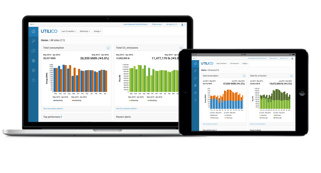
Energy Manager turns data into interactive visualizations so businesses can find anomalies and problematic usage patterns that cost them money. Energy Manager was designed for tablet and desktop use.
I was the design lead for this energy management application from the initial phases of user research, requirements gathering to data visualization and interaction design. Using best practices and workflows of energy managers in the field, Energy Manager was created to accommodate quick prioritization, exploration and deeper analysis.
Developing empathy and learning from domain experts
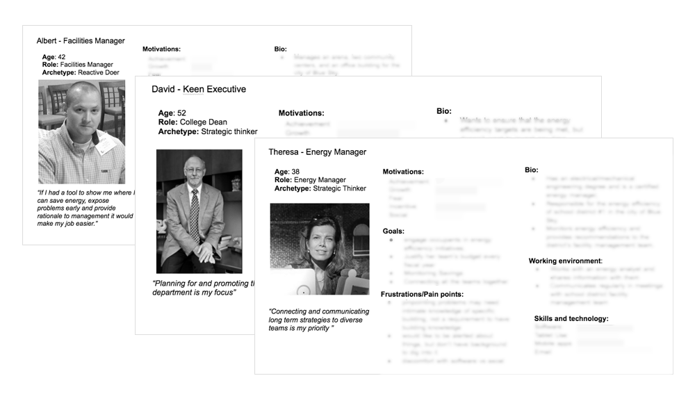
Throughout the project I worked closely with the product manager to interview a panel of energy advisors as well as internal experts. We would meet for informal interviews both in-person and remotely to gain insights, domain knowledge and to do qualitative user testing for new features. We would distill our findings to identify common pain points and frustrations to create user stories and prioritize features.
Workflows and product features were influenced by the goals, frustrations and pain-points captured in user personas. Blurred for confidentiality.
Open to iteration
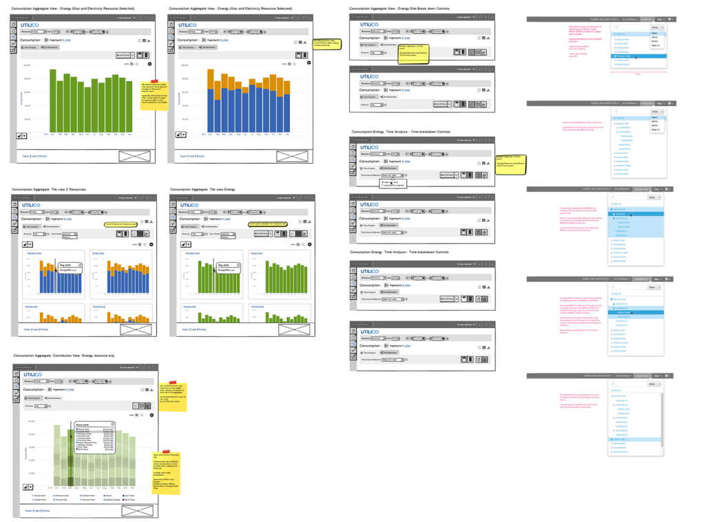
Working closely with my development team I produced wireframes at differing levels of fidelity to communicate interaction behaviour as well as visual design. I strove to communicate with my team the detailed specs and overall user goal of a feature so everyone involved in building the product shared the same definition of success. Many features required rounds of definition and collaboration to ensure back-end development and intended feature behaviour was balanced.
Wireframes used to communicate intended behaviour of data visualizations and space hierarchy navigation with development team.
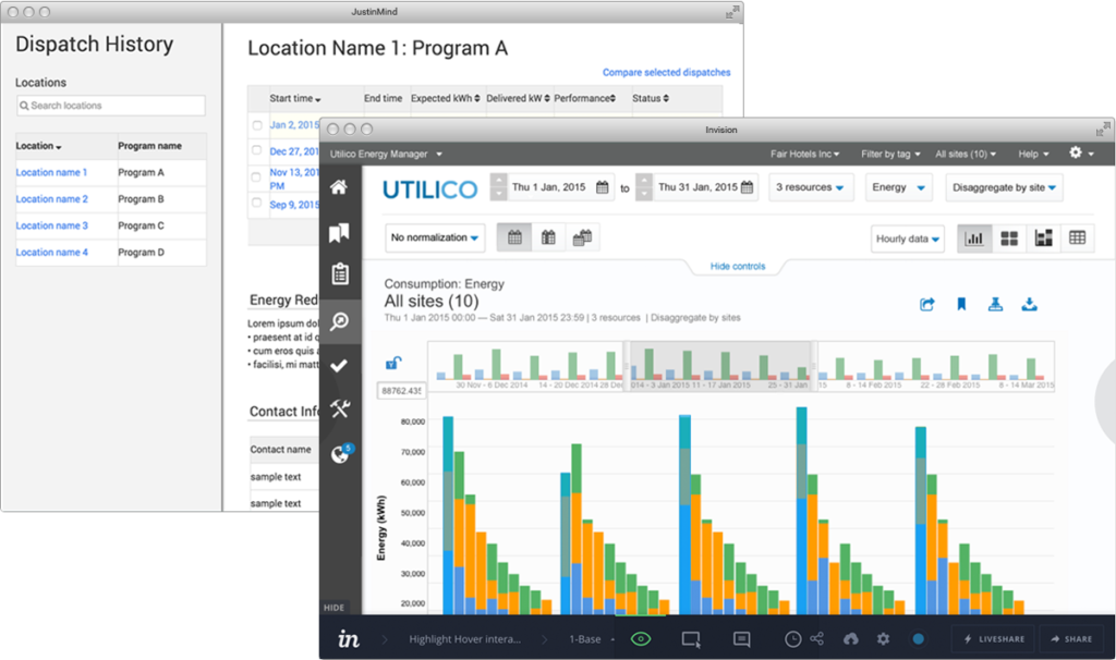
Clickable prototypes used for testing and for communication to development team.
Interaction and visual design
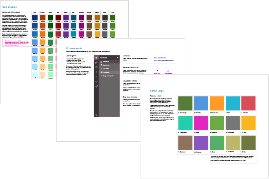
New data visualizations, colour logic and custom icon fonts were created. Keeping the visuals consistent within the product family was important as components were often reused. Depending on the program, customers may have access to multiple products at the same time. Ensuring visual and interaction consistency helped lower the learning curve across applications. The information architecture and navigation of the application was greatly improved, which helped lower task time. Flexibility in data exploration was a key improvement with new configurable controls that provided immediate feedback.
Linked views follow energy management workflows of viewing coarse data and drilling down to details.
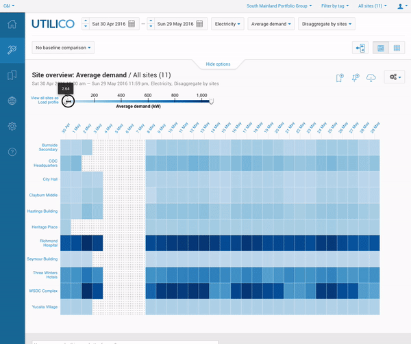
Different visualization methods of combining and dividing demand data

A few pages from the UI Branding Guidelines document used by the customer success team.
Seeing the whole picture
There were also other touchpoints I worked on to improve the overall user experience. I used customer journey mapping to identify gaps in the service for email, developed better onboarding materials for both the business utility side and the end to end program lifecycle of the user, this included the landing page, registration process and various emails for different product lifecycle stages.
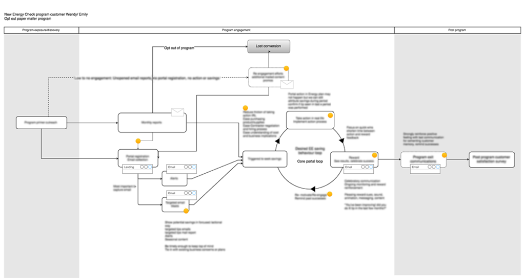
Customer engagement journey map through a typical program. Blurred for confidentiality.
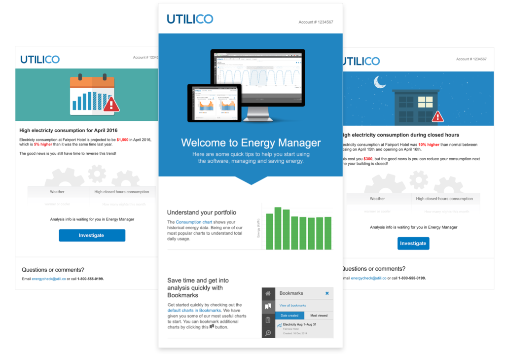
Product engagement email design and illustrations for educational and alert notifications.
The list below is a description of the product that was shipped for MVP. I worked in an agile development environment to build and iterate the features below. All features were designed to provide flexible tools that get out of the way of the energy analyst and allow them to make better business decisions.
Features:
- Data visualization for different energy investigations
- Time analysis modes to spot patterns
- Configurable homepage widget cards
- Data configuration options for exploration
- Contextual help menu design
- Portfolio and access control based on business organizational structure
- Tags for data segmentation
- User management for your team
- Alerts based on analytics
- Bookmarks for saving explorations
- Notes for record keeping and sharing
- Data exports in visual and data forms
- Email engagement design and content planning