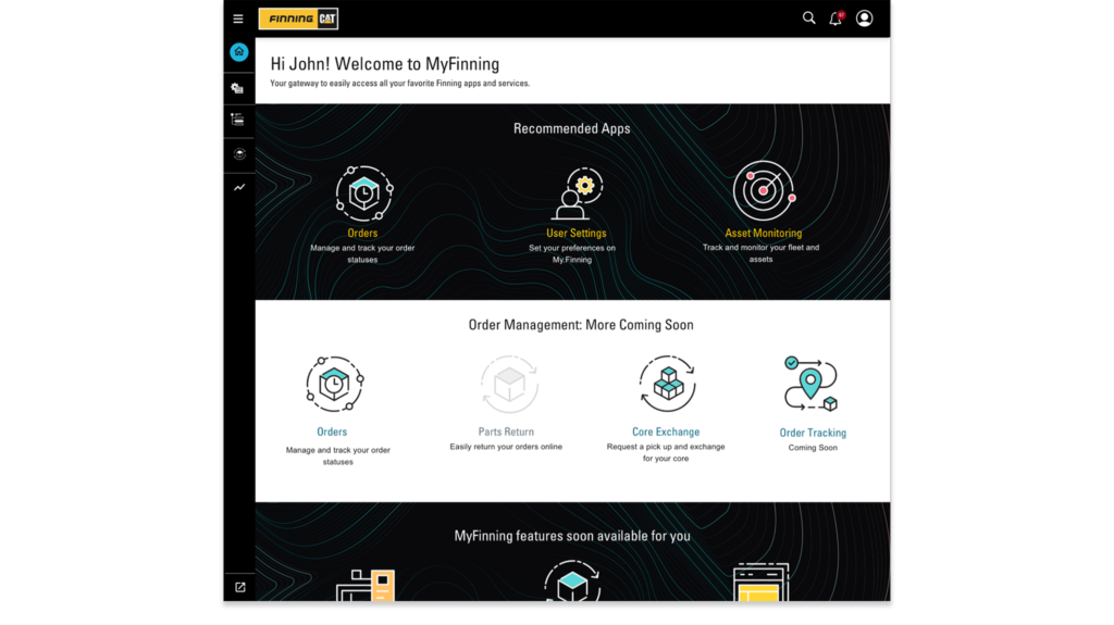
My.Finning.com Customer Cloud Platform
Creative Fields // Stakeholder Management, Cross-functional Team facilitation, Workshop Facilitation, Early Concepting to Hi-Fi Prototyping, Project Management, User Research and Testing, Research Recruitment and Program Development, Playbooks and team process creation
Client // Finning
Project details
Background
Finning is the largest CAT heavy machinery dealer and service provider in Canada and the UK. The platform provides Finning customers in Canada and the UK access to machine telemetrics, parts ordering and tracking, and service information.
The platform consolidates information across multiple legacy applications, replaces a number of paper processes, and allows customers to gain access to machine and service information that was previously difficult to access. The cloud platform provides Finning with opportunities to engage and better serve its customers across multiple touchpoints.
My Role
I was the lead on this project with five other designers, to bring Finning’s customer cloud platform to market.
My responsibilities included:
- Design QA across four app squads for consistency to nascent Design System
- Communication point between design and tech, data and stakeholder teams
- Design resource for detailed design as in several squads to meet milestones and timelines
- Improve design processes and documentation
- QA of implementation to ensure design intent
- Recruit and facilitate user testing and feedback as part of Finning practices
- Creation of playbooks and education materials for elevating design impact in Finning
Notable outcomes
- I received the “MVP” Most Valuable Partner Award from Finning 🙂
- Part of the playbook I created for user feedback education published in TouchPoint – The Journal of Service Design.
Design question
Finning’s original aspiration was to provide a “single pane” of glass for customers.
Part of Digitalist work was to unwrap this vision and understand what digital services would create value for Finning customers? How would this improve the business processes of Finning to become more efficient and increase revenues?
Discovery and assessment
Competitive analysis and usability audit
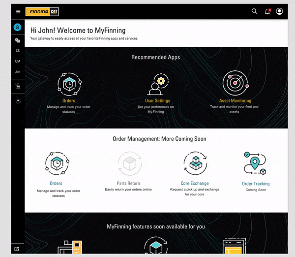
When I was brought in to this project, a proof of concept prototype existed that was used as a sales tool.
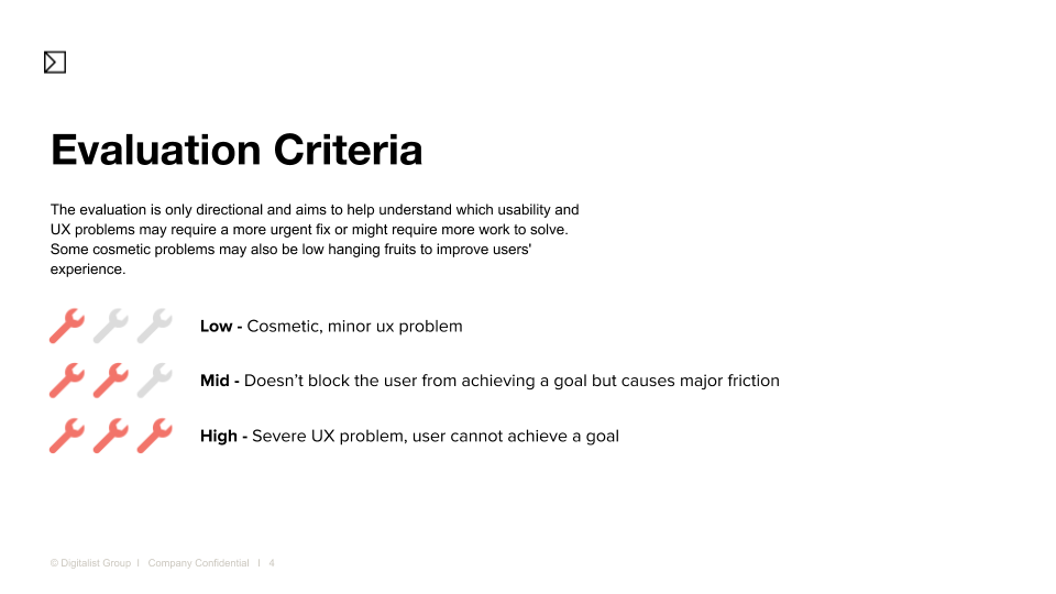
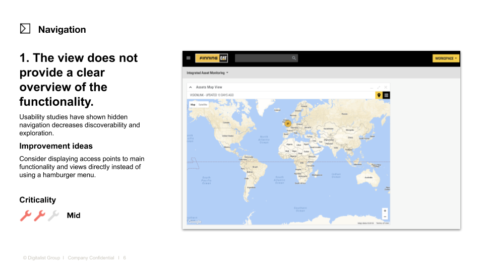
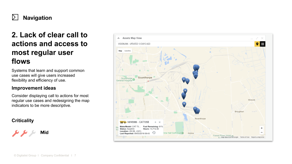
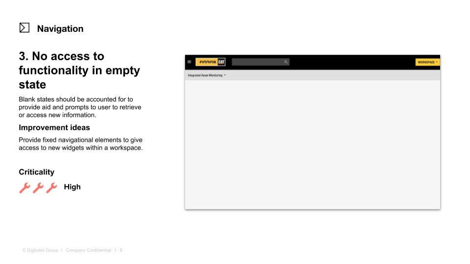
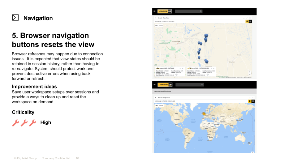
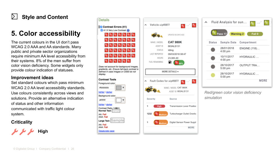
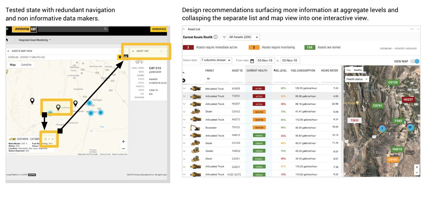
I reviewed competitive products in machine telematics and conducted a usability audit in conjunction with another designer. We presented the audit in a report to stakeholders with prioritized issues based on our expertise. This report highlighted the need for validation with customers before launch and a tighter MVP feature set.
See sample report pages below highlight issues
RITE Testing Findings
I collaborated with a group of user researchers running a 3 month pilot program for quick RITE testing on the prototype to validate issues that were identified in the usability audit I conducted.
Issues that customers voiced pointed to confusion in navigation, a need for better tools for data aggregation and hidden functionality:
“You gotta start drilling down or clicking multiple times to get to where you want to go. When you do that every time you open it it’s time consuming.”
“I’m not able to design the workspace the way I want to. That automatically means I’m not able to complete the task.”
“You almost always want that bird’s eye view so you can get the gist of what’s going on. But if something sends you a warning you can drill into that and get as much or as little detail as you need.”
After the feedback was collected, high-value tasks and interaction concerns were prioritized with the client’s product team.
I provided design options for quick wins and longer-term fixes to improve navigation, information hierarchy, and task completion.
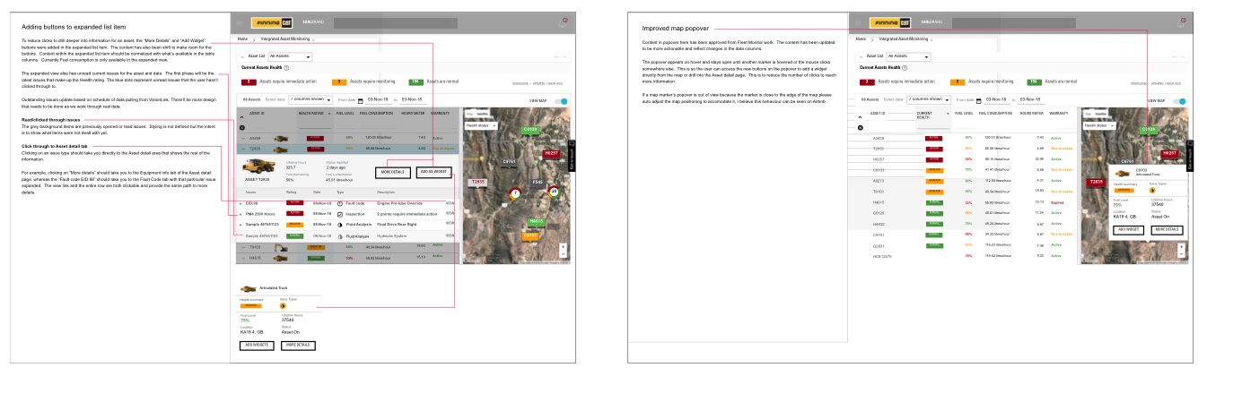
Documentation for interaction and data visualization improvements from RITE testing results
After the review and RITE testing feedback, the team and I clarified the product strategy to where the new platform would be an enhancement to the overall ecosystem of services rather than a replication of all competitive product features. This helped to pare down features and give focus to the product roadmap.
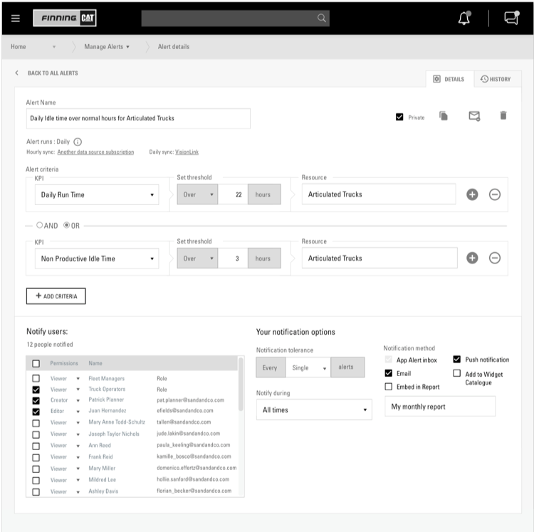
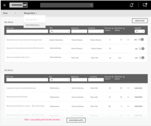
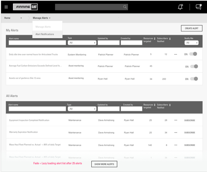
I also conducted ongoing user testing on new features such as Alerts and Notifications with technical product specialists who would be setting up the product and monitoring sites for customers. Below is a sample of the prototype in grey scale used for gathering feedback on task flow and content.
Alerts and notifications wireframes used in user testing with a clickable prototype
-

- Notifications inbox

-
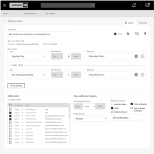
- Alerts rule custom builder
-
- Active alerts and template alerts view
Facilitating Continous User Feedback
Throughout the project, I strove to drive change in the organization towards collecting user feedback and early testing. Initiatives I undertook included:
- Getting stakeholder buy in to conduct feedback and user research
- Recruiting contacts that had direct customer interaction from technical, sales and customer support
- Creating user interview scripts and conducting user interviews and contextual inquiries
- Regular remote and in-person user testings on a bi-weekly basis
- Facilitating and educating product management team in user interviews
Below is a sample of a prototype animation I created for a proposal to senior stakeholders to update the platform navigation from a horizontal breadcrumb-like menu as seen in the usability report. These changes also updated the information architecture which had from a mixed hierarchy and removed redundancy.
The new version is a more scalable slideout side menu that was consistently visible with clearer wayfinding and showed the hierarchy of applications and sub-applications. The menu also allowed the mobile version of the app to have a consistent experience with the desktop version, while still being balancing the requirement for some legacy designs features such as to brand placement, and the mobile hamburger menu use.animation to illustrate navigation improvements used in presentation to stakeholders
Prior state of navigation illustrating lack of information architecture
Prototype navigation animation for stakeholder presentation
Data and third-party integrations
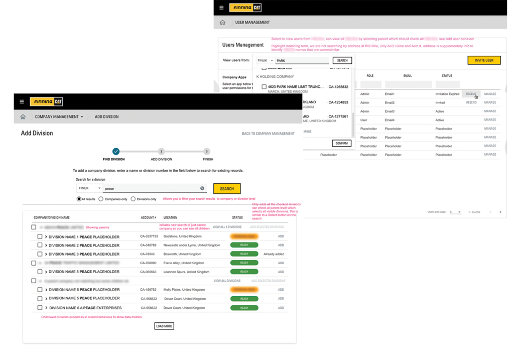
A lot of my hands-on design work was on platform tools. In addition to the customer, the platform also had different views for Finning administrators and customer service representatives. Features for these roles included invitational processes and customer accounts management, which required understanding the technical limitations within the data structure and corporate company structure. I had to balance these limitations and data idiosyncrasies from multiple legacy and ERP systems while creating a smooth onboarding experience for account registrations. I also worked on integrations with multiple 3rd party login tools, app and data permissions processes for privacy and compliance.
Data structure for adding a customer and for adding a company
Design system and SDK components
The platform required heavily customized components in order to accommodate technical limitations and workflows. As a team, we decided to use Google Material based components for speed and as a starting point to form a cohesive visual style while still adhering to existing brand guidelines. We also had to maintain and future proof components and behaviour for the SDK kit to ensure they were generic enough to support new apps as they were developed. I provided oversight for these considerations to the platform team and the 3 other app squads.
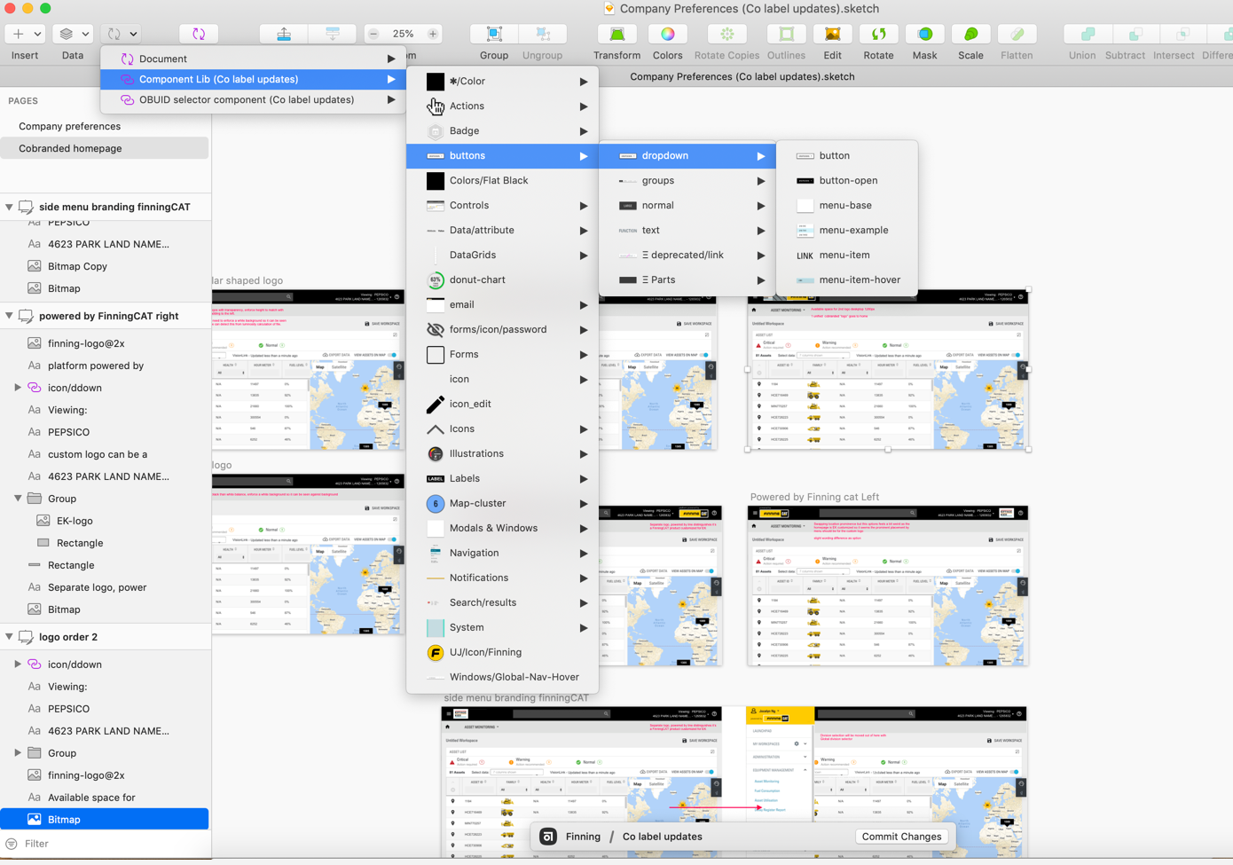
We managed our design system in a Sketch library that we updated through Git and later on Abstract as the version tracking software. The entire team contributed to the Design system. My responsibility was to review new components as they were created and existing component usage to check for adherence to patterns.
The Design System helped the team quickly create high fidelity wireframes to show stakeholders. This was important to achieve buy-in for changes and improvements.
Design system in Sketch libraries for rapid prototyping
Driving organizational change towards design
Other areas of work involved engaging with stakeholders and evangelizing design best practices. Even though I was working as an outside consultant, my goal was to provide the client organization tools for gathering feedback that they could implement within their culture.
I created an educational playbook that explained common user research methods and listed tools and resources on how to conduct them.
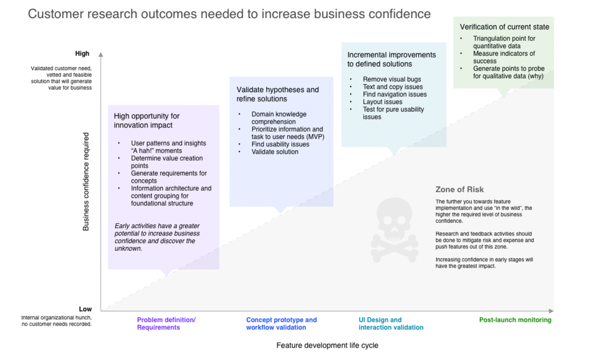
I also wanted to present the tools and methods graphically to highlight the business value and importance of these methods and using them at the right product stage.
User Feedback Playbook graphic illustrating business value of methods
Improving onboarding by removing service barriers
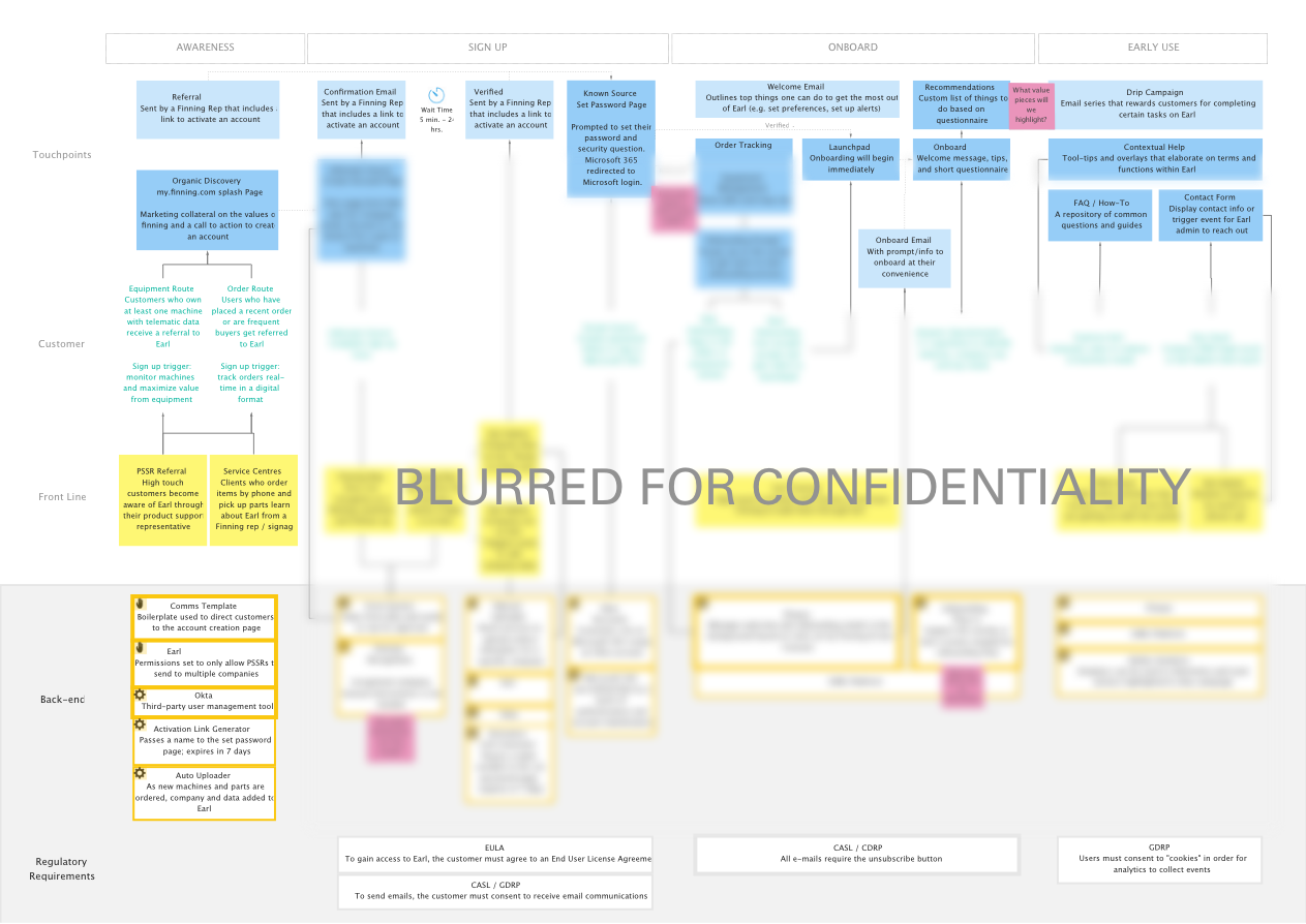
I also worked closely to outline the onboarding process of the platform with the product manager. The organization had many departments with their own preferred customer channels. Mapping this out was key to understanding the customer’s journey and providing a good overview of which departments needed to work together to provide the customer with a clear onboarding process.
Finning’s customers were used to transacting via phone, in person, and in physical store locations. This would be customers’ first exposure to online self-service, so I highlighted the importance of an onboarding process that was timely, informative, clear and connected across touchpoints. I created this service blueprint to show the frontstage and backstage processes that would need to occur from awareness to adoption.
Through this mapping with product stakeholders, we uncovered crucial data blockers to the onboarding experience as well as opportunities that would otherwise have been missed, such as guided product tours and a help center.
Onboarding Service Blueprint, blurred for confidentiality. Click image to enlarge
During my time on this project, I was also involved and consulted for other projects such as an enterprise mining monitoring project for the South American market, the company intranet, and marketing initiatives.
I also performed a number of project management duties including:
- Maintaining UX backlog
- Planning design work for sprints
- Prioritizing UX debt
- Writing user stories
- Epic planning for future quarters