Visual Redesign
Client // CHIMP Charitable Impact
Project details
As part of CHIMP’s rebrand, the logged-out experience of the site and overall UI design needed to be updated. Taking direction from the proposed brand colour palette and sunburst style logo, these concepts were created for desktop and mobile view.
Design problem
How might CHIMP’s website and UI be updated to be more inline a new brand palette and also use better information hierarchy to provide clarity and help users give easily and discover new charities?
As a team, we reviewed the proposed brand palette and addressed any accessibility issues we could foresee before diving into individual concepts. These were my proposed ideas for how the home could be restructured to support users’ main goals of making a donation or charity discovery. We found from Google analytics and customer feedback logs that most users came to the homepage looking for a way to give to charity. Priority was given to the charity search as well as suggestions of charities to donate to based on location or history. More succinct descriptions were written in the About Us page designs to address needed clarity in communicating user benefits for donating through CHIMP. The global navigation was whittled down to address continuity problems between the logged out and logged in experience.
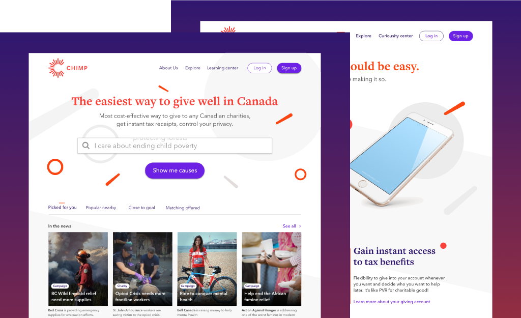
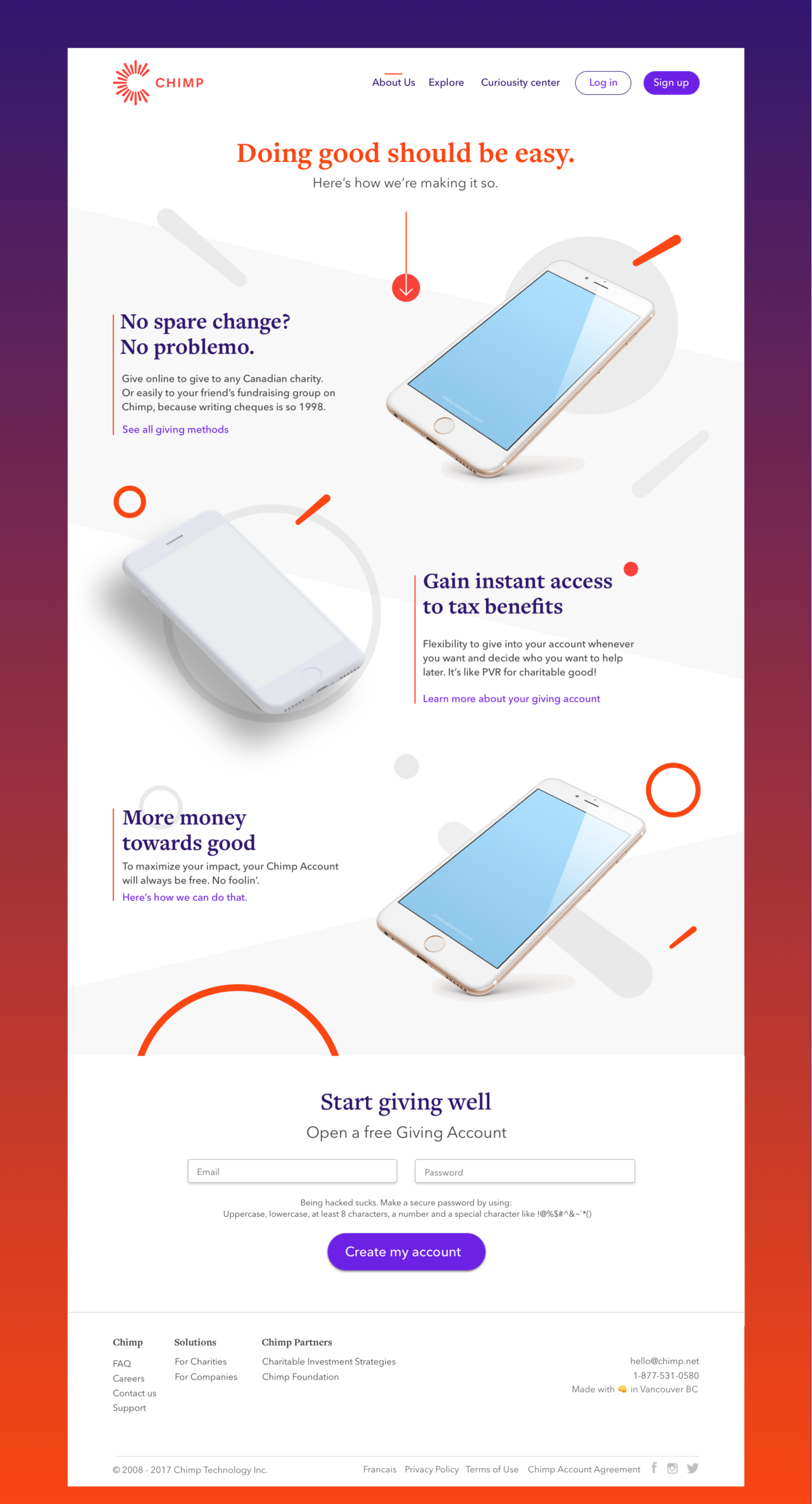
First concept with mobile views using pieces of the logo as graphical elements and an animating search bar with suggestions.
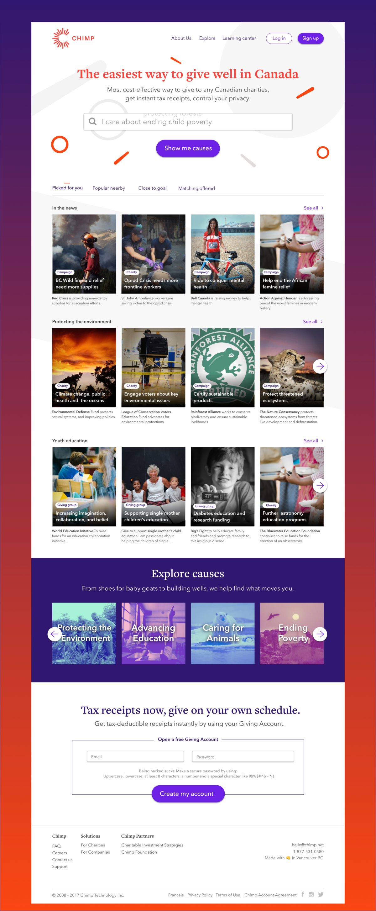
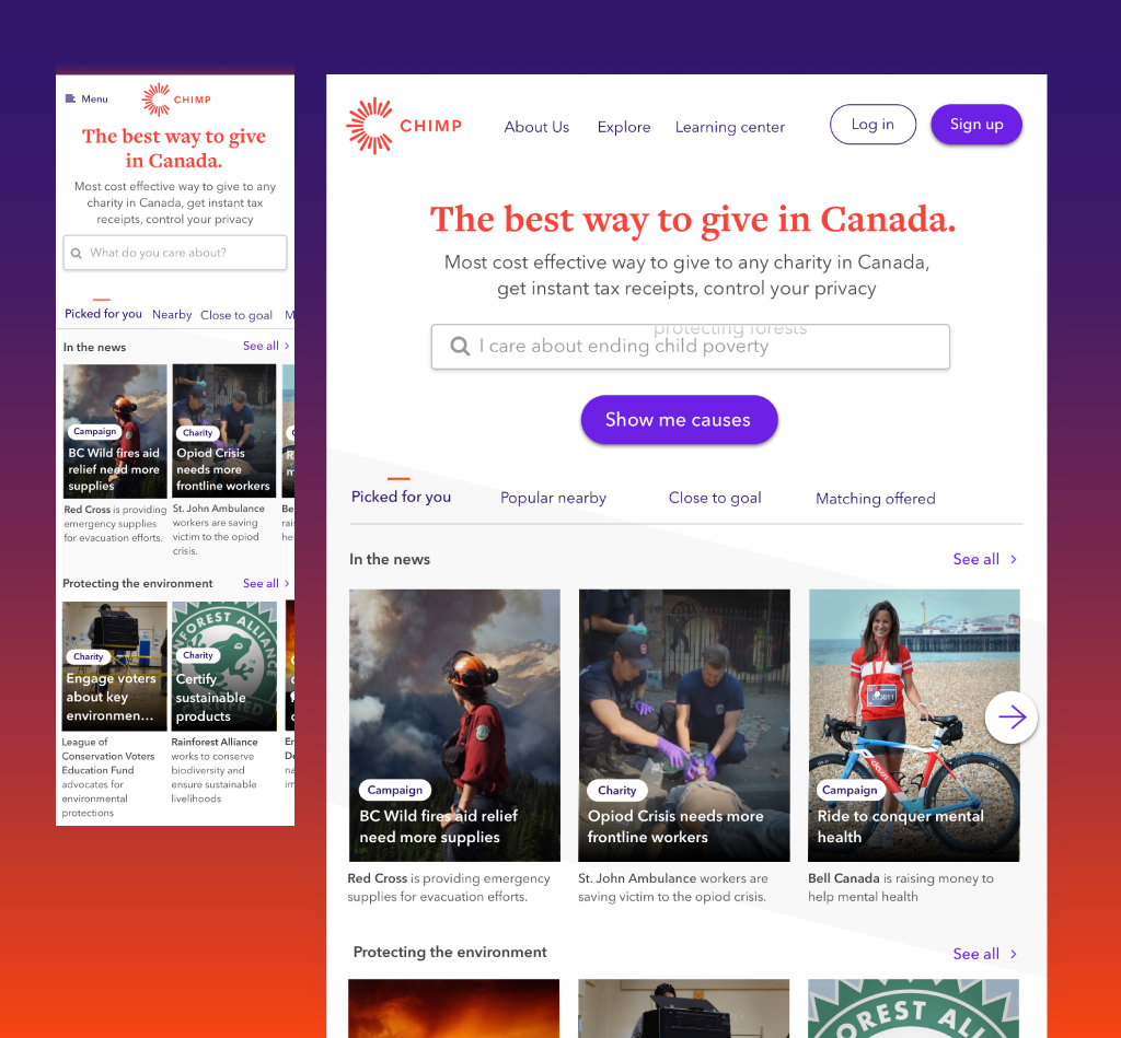
Second concept using background of overlapping logo pieces.
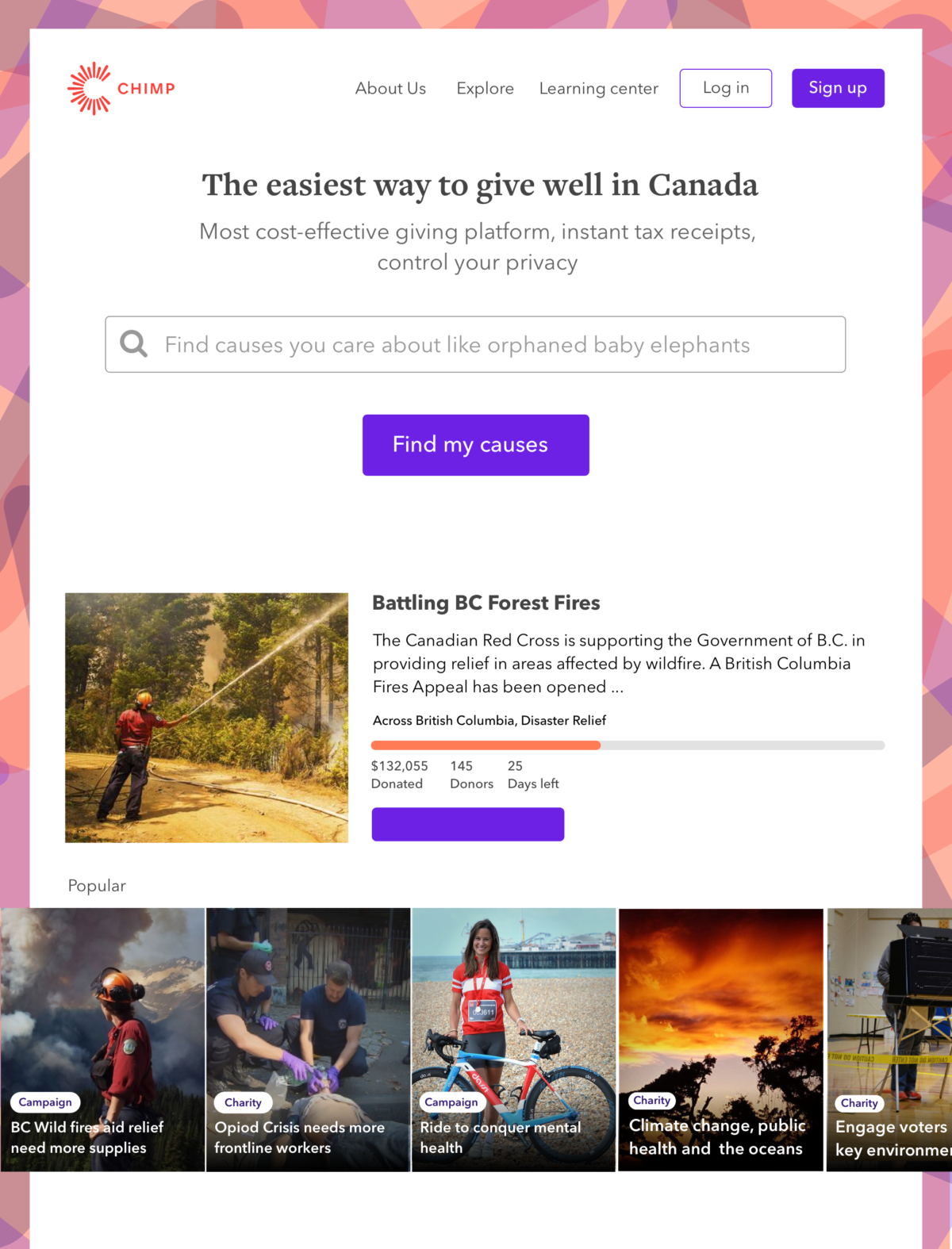
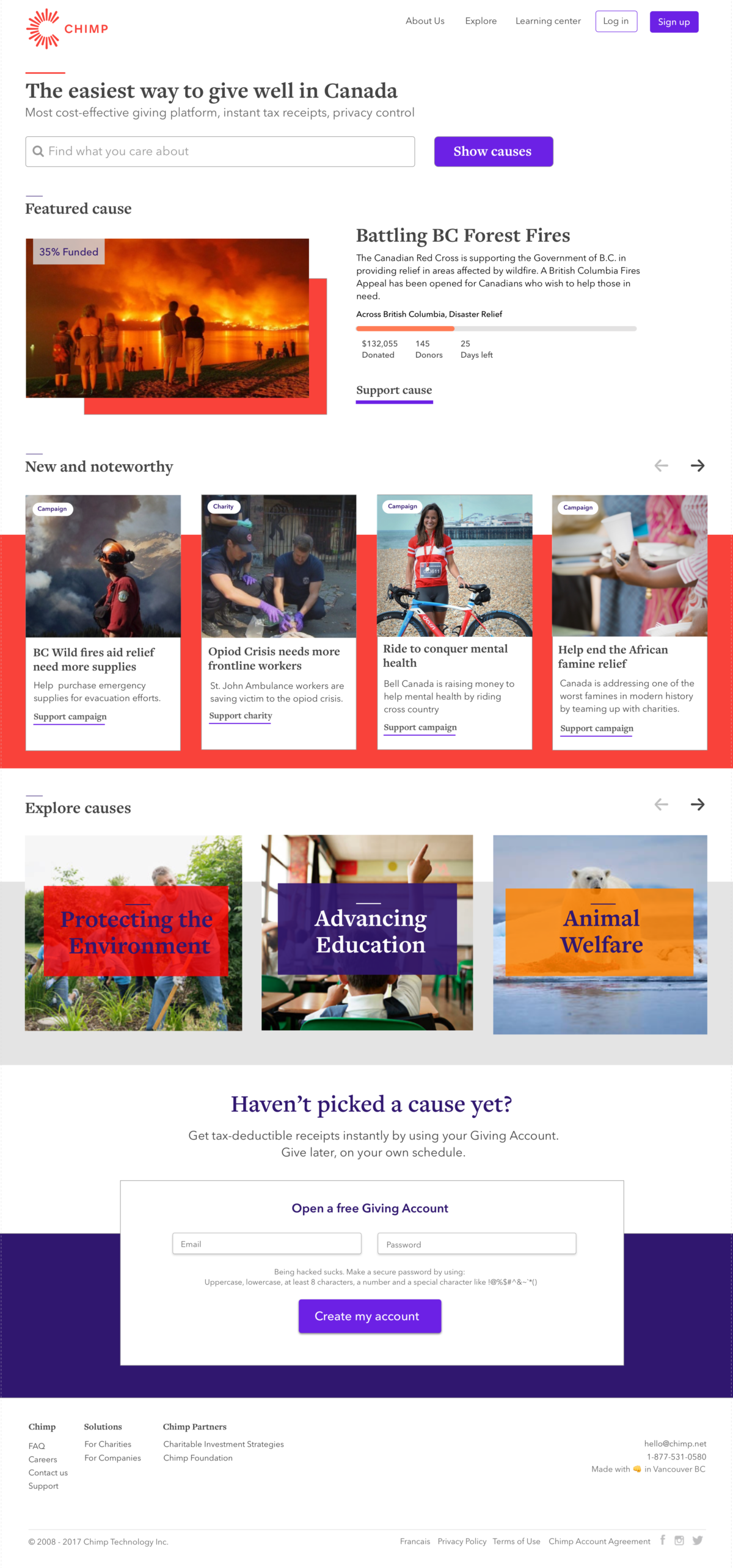
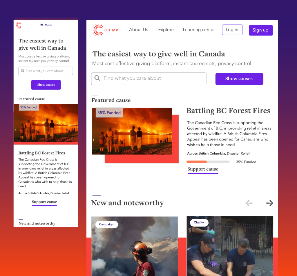
Third concept with mobile views using rectangle graphics for image emphasis and a right aligned layout.